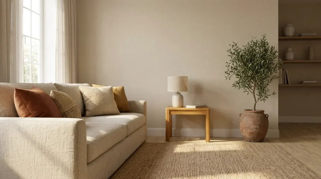
Colors for Organic Modern Rooms Start With the Wood and Not the Paint Chip
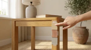
The best colors for organic modern rooms are warm earth tones that share the undertone of your largest wood piece in daylight. Three easy ways turn this rule into a finished palette and each way names one step you can try this weekend with a $5 sample pot plus one sheet of poster board.
Key Takeaways:
- Match the wood undertone before you pick a wall shade.
- One ochre family supplies yellow, orange and red neighbors.
- Cool tones stay on one small object.
- A $45 textile plan works for renters.
A beginner can test a single patch on poster board. A renter can skip paint and use cloth. A confident painter can deepen a whole wall in one weekend. Every way below works with paint or fabric. Dollar figures are our guesses and no shop priced them. Britannica provides the only sourced facts.
Three Easy Ways to Give a Room One Warm Undertone
Organic modern color is mostly neutral with a warm lean. The wall, the largest wood piece and the biggest textile do most of the work. The full design steps sit in the five-step organic modern room design plan and this page covers color only. Each way below fixes one common mistake: a cool wall beside warm wood, a flat palette or a cold accent.
Work through the ways in order. The first sets the base. The second adds depth. The third controls contrast. Skip a way if your room already solves it. A room with honey oak floors may need only way two. A room with gray vinyl floors should start with way one. Photograph each result in the same light for later comparison.
Match the Wall Color to the Undertone of Your Largest Wood Piece
Find the undertone of your largest wood piece before you open a paint can. Orange, red or honey tones read as warm. Gray or ash tones read as cool. Check the inside of a drawer. The finish is thinnest there (our reading). Hold a sample against that bare spot in daylight.
Pair warm wood with a warm wall such as sand, clay or a soft yellow ochre. Pair cool wood with a greige wall that leans slightly warm. Avoid a pure cool gray beside any oak or walnut. The gray makes the grain look yellow by contrast (our reading). A mismatch shows most near a window where the two surfaces meet.
Let Yellow Ochre Lead and Let Its Heat-Shifted Cousins Follow
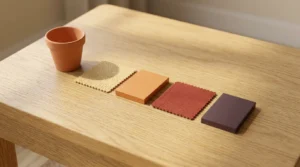
Yellow ochre can lead a palette because its cousins come from the same earth. The Britannica entry on ochre lists careful heating as the route from Mars yellow to Mars orange, violet or red. Paint makers sell warm yellows, oranges and reds in matching families (our reading). Treat the heated colors as neighbors on one dial. The table below details earth pigment chemistry guidelines established by Britannica specialists.
| Number & Insight | Source | Expert/Team |
|---|---|---|
| Mars yellow is hydrated ferric oxide, either pure or mixed with a clay or lime base. | Britannica | Encyclopaedia Britannica |
| Careful calcination can turn Mars yellow into Mars orange, violet or red. | Britannica | Encyclopaedia Britannica |
| Britannica describes the heated results as reliable pigments. | Britannica | Encyclopaedia Britannica |
| Ochre is also prepared artificially in large quantities. | Britannica | Encyclopaedia Britannica |
| An engraved ochre piece from Blombos Cave in South Africa is at least 70,000 years old. | Britannica | Encyclopaedia Britannica |
Use the dial in order. Put the pale yellow on the wall. Put the orange in a cushion cover or a throw. Put the red in one small object such as a vase. Keep the violet for the deepest spot, such as a lamp base. Each color gets its own surface. The palette then reads as a gradient. Skip the violet in a small room.
Hold Every Cool Tone to One Small Object
Colors for organic modern rooms stay warm because cool tones are rationed. Give cool tones one small object such as a charcoal bowl or a sage vase. A good limit is about one tenth of the visible surface (our rule of thumb). Count only the objects in your main sightline from the doorway. Ignore items hidden inside cabinets.
A cool tone works as a pause. It rests the eye between warm surfaces. Black metal counts as a cool tone. Count a black lamp or frame in the same tenth. A small room needs the cap more than a large one because each object fills more of the view. Swap the cool object each season for a cheap refresh.
Sample Patch Size: 2 Feet Square Is Our 2026 Pick
A 2-foot square patch shows a color better than a small chip. Paint it on white poster board and not on the wall. A sample pot runs near $5 (our estimate). A large sheet of poster board runs near $4 (our estimate). Tape the board at eye level and live with it for two days.
Move the board to the wall behind the sofa, the wall by the window and the wall by the door. Each place gets different light and different neighbors. Write the time of day on the back of the board. Tape a fabric scrap and a wood offcut beside the patch. The three together show the real combination.
Light Check: 3 Times of Day Before You Commit
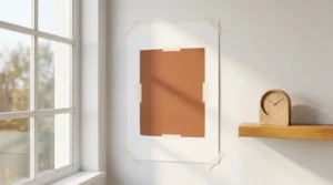
Check the patch at 9 a.m., at noon and at 6 p.m. Daylight runs warm at sunrise, cooler at noon and warm again near sunset. A north-facing room gets cooler and steadier light than a south-facing one in the northern hemisphere (our reading). Add a lamp test after dark. Warm bulbs deepen yellows and reds. Photograph the patch under each bulb for comparison.
Pick bulbs before you judge the color. Keep the bulb box to read the number later. A 2700K bulb gives a warm white glow. A 4000K bulb looks cooler and more neutral. Mixed bulbs in one room make a palette look uneven. Choose one bulb color for the whole room and test the patch under it.
Renter Color Plan: $45 in Textiles Instead of Paint
A renter can change the colors for organic modern rooms with cloth. A neutral sofa gives the cloth a calm backdrop. A $20 throw in yellow ochre warms a gray sofa, by our estimate. A $25 cushion cover in clay adds the first heated cushion. Together, the two cost $45, by our estimate. Both leave the walls untouched.
Place the throw and the cover on the sofa. Leave the floor to the rug. Eye level carries color better than a rug does (our reading). Return anything that looks wrong in daylight. A removable fabric hanging can add a third color later. Skip peel-and-stick wallpaper unless your lease allows it.
Warm Wood Decides the Palette and Ochre Keeps It Connected
The colors for organic modern rooms come down to two decisions. Match the undertone of the wood. Let one ochre family supply the neighbors. Everything else is a small object in a cool tone. These choices cost far less than furniture. A $5 sample pot can prevent a $100 repaint, by our estimate. Write both decisions on a sticky note. Check each item against it. Carry it on trips.
A calm palette lowers the number of later decisions. Showroom lights differ from home light, so carry a swatch. Each new object can be judged against the wall and the wood. The room then grows without drifting off course. Tell us in a comment whether this palette plan helped your room. If it did, pass it to a friend who is stuck on paint chips.
Frequently Asked Questions (FAQs)
What are the best colors for organic modern rooms?
The best colors for organic modern rooms are warm neutrals such as sand, oat and soft yellow ochre. Add one deeper clay or brown shade for weight. Keep every color close to one undertone. A varied mix of undertones makes the room look unplanned.
Can you mix warm and cool colors in an organic modern room?
You can mix them in a small dose. Choose a cool tone with a green or blue-gray base. Avoid an icy blue. Sage sits well beside oak. Charcoal sits well beside walnut (our reading). Avoid cool tones on large surfaces such as a sofa or a rug.
Does organic modern need white walls?
Organic modern does not need white walls. Oat, sand and warm greige all work as backdrops. White trim can stay if it leans creamy. A stark white trim beside warm walls looks sharp and a little cold.
What paint finish suits organic modern walls?
A matte finish suits living rooms and bedrooms. It hides small wall flaws. Use eggshell near kitchens and bathrooms. It wipes clean more easily (our reading). Test the finish on your poster board patch before you buy a full can.
What color goes with a beige sofa in an organic modern room?
Clay, rust and deep brown go well with a beige sofa. Use them in cushion covers and a throw. Add one natural wood table to link them. Keep the rug a step deeper than the sofa so the seat does not blend into the floor.